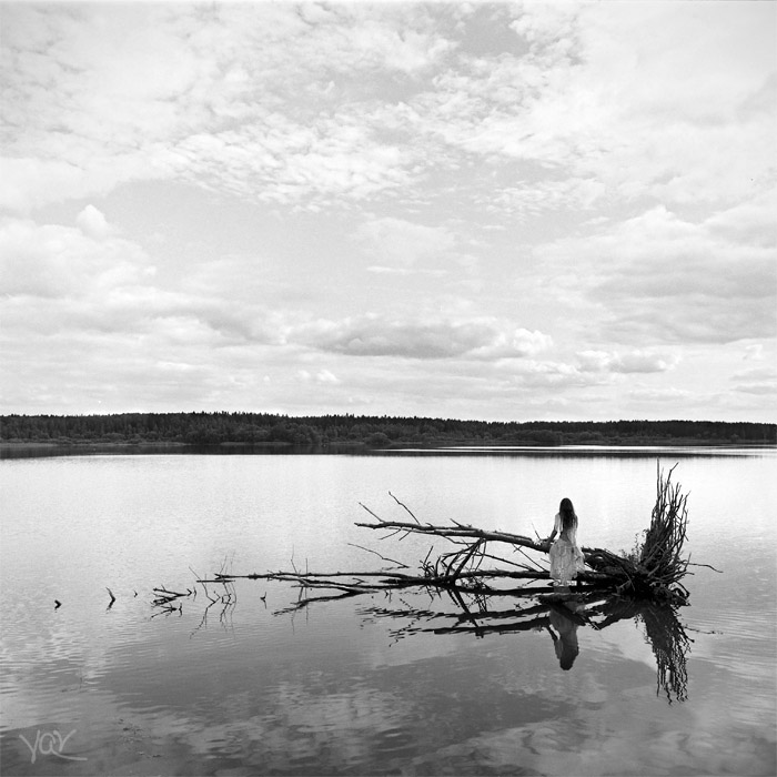
I should have cropped the forest and darkened the sky a bit. It would have been a really expressive photo, a look into infinity. I understand it's film and pristine, but sometimes you can and should remove unnecessary details.
Nikolay Maminov (Nikolodion), so did you simplify or overdo it??? ... If you simplified, then what did you simplify? ... If you overdo it, then where? ... I'm just remembering your master class now... Those words don't really fit with these... You said that not everything in a photo should be perfect, and that's never the case. The main thing is that it makes you look, think, and even look for flaws! Everything the author wanted was conveyed (look how many questions about the "demons" arose!). Perhaps the sky should have been darker and the forest lighter, or details should have been removed or added, but WHY? What would change? The perception of the photo - no. Only there will be fewer comments from real photographers
The work is restrained and minimalist (with just the right amount of detail :)). The only annoying thing here is the sky: it's fundamentally different (almost a flaw) from the bottom. And then it depends on the artist's intentions: the sky could have been tightened up, it would have been nice, but it's standard. As it is, there are two distinct spaces. I personally like it here.
I agree, the sky breaks your perception, it hurts your eyes, you want to tighten it, but then you realize: this is precisely what prevents you from immediately closing the page and saying that it’s just a good photo

Alexander Lebedev, what do you think?
I understand it's film and pristine, but sometimes you can and should remove unnecessary details.
People are interested, worried...
ah...
I don't like him myself.
Let's at least require anonymous users to indicate the reason when giving low ratings
Well done!